
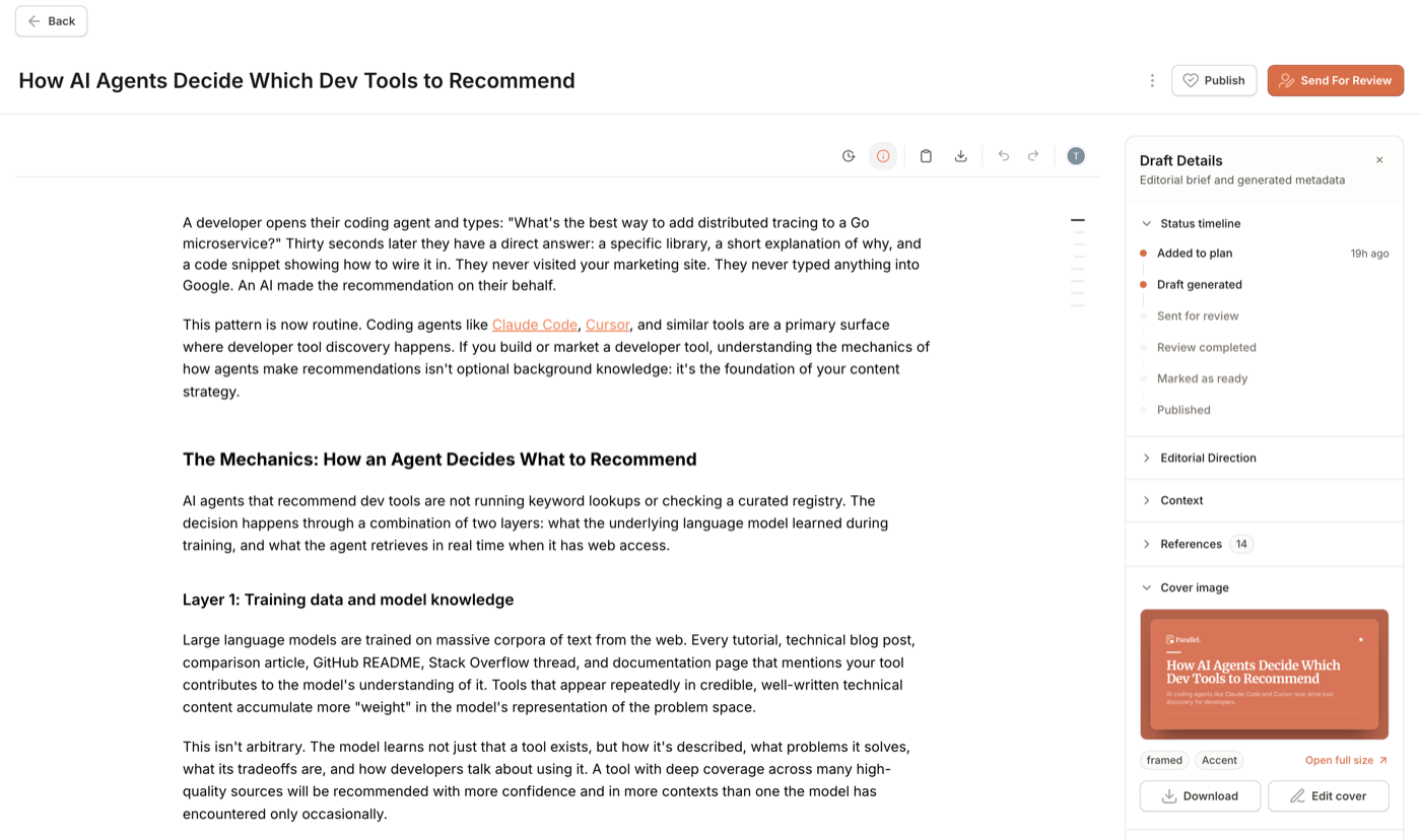
Every post generated in Parallel now comes with a cover image, automatically. No prompt to write, no diffusion model to cross your fingers with, and no stock photo that almost fits. Just a clean, on-brand cover pulled straight from your workspace's own visual identity.
The problem with AI-generated cover art
If you've tried using a diffusion model like Midjourney or DALL-E for blog headers, you know the drill: you write a prompt, get back something moody and abstract, and then spend ten minutes trying to coax it into using something close to your actual brand colors. The text it generates, when it generates any at all, is usually garbled. And the fifth cover you make ends up looking nothing like the first, because the model has no memory of what "on-brand" means for your company.
That's a fine trade-off for a hero image on a landing page. It's a bad one for a blog, where readers scroll through a feed and covers are the first (and sometimes only) signal of what a post is about and who published it. Consistency matters more than novelty.
How Parallel does it instead
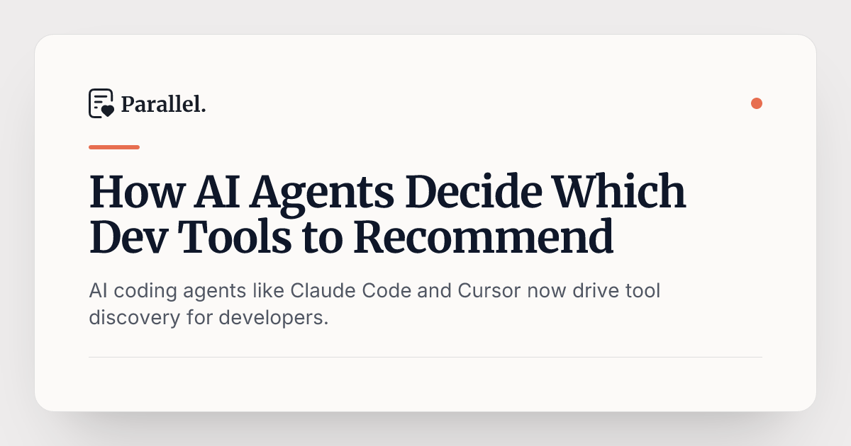
Rather than asking a model to guess at your brand, Parallel renders each cover from a real template, using your workspace's actual colors, fonts, and logo, pulled from the same brand profile that already keeps your writing on-voice. The result is crisp, readable text and exact brand colors, not slightly-off AI-art hues that need a second look to place.
Here's an example cover image:
Because it's template-based rather than generative, every cover:
- Uses your literal hex values, not an approximation
- Renders your actual typeface, loaded from Google Fonts, not a generic system font
- Includes your real logo, positioned consistently across posts
- Comes back in under a second, so iterating costs nothing
10 templates, 3 styles, zero clicks by default
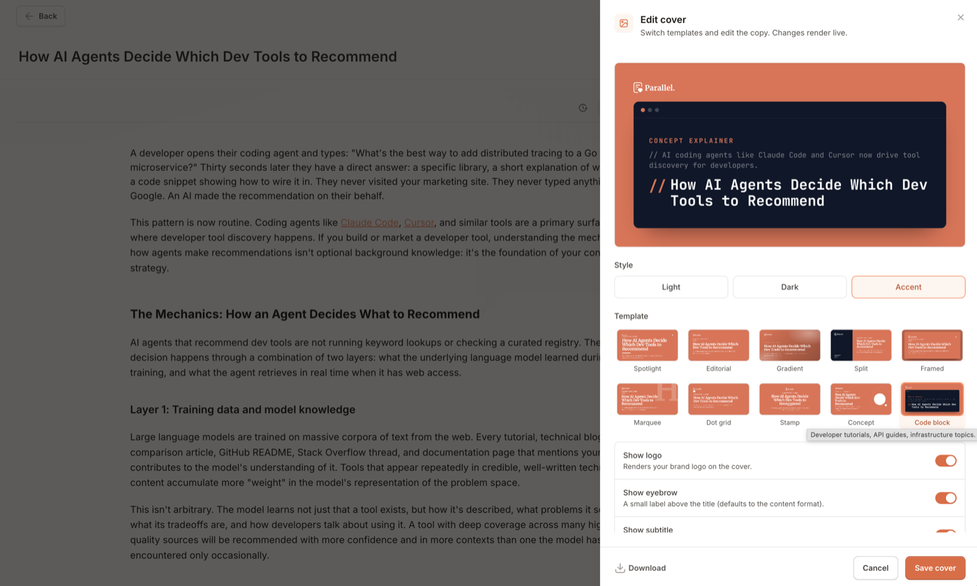
You're never stuck with the first result. Open the cover editor from any post to pick from 10 templates:
Spotlight, Editorial, Gradient, Split, Framed, Marquee, Dot Grid, Stamp, Concept, and Code Block
Each is available in three styles: Light, Dark, and Accent. Every combination renders live as you edit, so you can compare designs side by side before committing to one. The headline and subtitle are editable too, not just the template: if the auto-generated copy runs long or you want a punchier hook, rewrite it right in the editor and watch the cover re-render on the spot. Show logo, show eyebrow, and show subtitle toggles let you tailor exactly what appears on the canvas, and you can download the finished PNG directly whenever you need the image outside of Parallel.
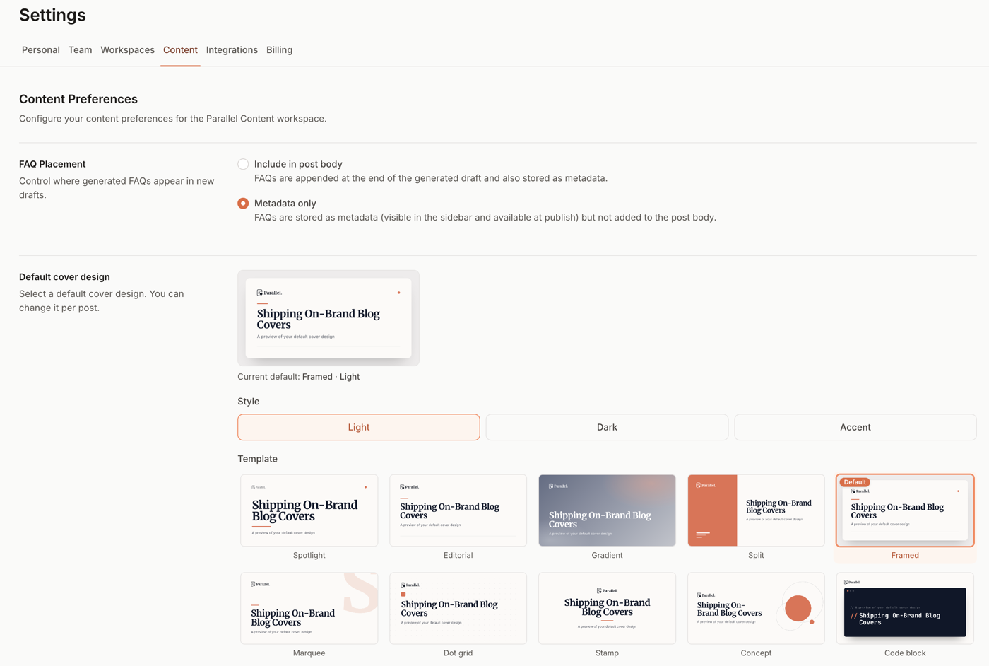
Most teams won't touch any of this by hand, though. Pick a default template and style for your workspace once, from Settings → Content, and every newly generated post starts with an on-brand cover with no extra clicks. You can still switch things up on a per-post basis whenever a specific post calls for something different, like a punchier Stamp cover for a short announcement or a Code Block cover for a deep technical tutorial.
It travels with your content
A cover image that only lives inside Parallel isn't much use. When you publish a post to GitHub or Webflow, the image flows straight into your frontmatter or your CMS image field alongside the rest of the content, no manual re-uploading required. If your post changes destinations or gets republished, the cover comes with it automatically.
Why we built it this way
We considered diffusion models first, since that's the default most teams reach for. Three things changed our mind:
- Text is the whole point. A cover image is mostly typography: a headline, maybe a subtitle, a logo. Diffusion models are still unreliable at rendering legible text, which is precisely the one thing a cover needs to get right.
- Brand consistency compounds. A blog with 50 posts and 50 slightly-different AI-art styles looks less trustworthy than one with 50 posts sharing a consistent visual language. Templates guarantee the latter by construction, the same way Parallel already keeps your writing on-brand post after post.
- Cost and speed. Rendering a template is close to instant and costs a fraction of a diffusion generation. That difference matters when you're publishing at the pace a growing content program requires, and it means you can iterate on a cover as many times as you want without a meter running.
It's also not a novel idea. Vercel, Linear, Stripe, and Resend all use templated, brand-aware text rendering for their own blog headers rather than AI photography. We're following a pattern that's already proven itself at the companies whose content programs we admire most.
If you're generating content with Parallel today, there's nothing to turn on. Your next post will already have a cover waiting for you. If you want a specific look, set your workspace default in Settings → Content and every post from here forward will match it.
New to Parallel? Try it for free and see your first on-brand cover generated automatically with your next post.