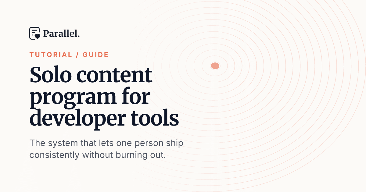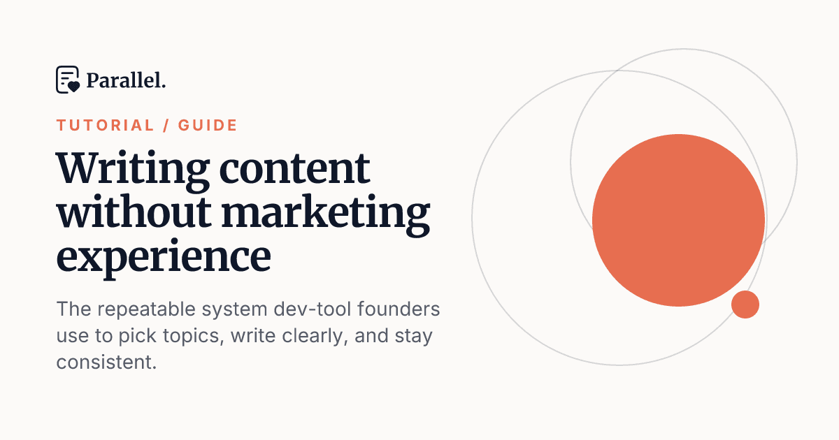
Writing the headline for a cover image is one of those tasks that sounds trivial until you're actually doing it. The article is done. The cover template is set. And then you're sitting there staring at an empty text field trying to compress a 1,500-word post into five words that are punchy, clear, and true to your brand — all at once.
Today we're shipping a feature that handles that starting point for you: Suggested headlines and subtitles in the cover editor.
What it does
Open the cover editor on any post and hit Suggest variations. Parallel generates three headline-and-subtitle pairs, each calibrated to a different level of boldness, so you can pick the tone that fits the post rather than compromise on a single option.
The three suggestions follow a deliberate escalation:
- Direct stays closest to your post's target keyword. The topic is unmistakable, which is what you want for search-driven content where clarity outranks cleverness.
- Balanced sharpens the angle a little, adding a hook while keeping the subject obvious. This is the middle ground most posts land in.
- Bold goes full thumbnail mode: curiosity-driven, punchy, written to stop the scroll. Better for opinionated takes and thought leadership than for tutorials where readers need to know exactly what they're getting.
Click any option and it drops straight into the headline and subtitle fields. The cover re-renders live as you make changes, so you can see the full effect immediately and keep tweaking from there. Not quite right? Hit Suggest more for a fresh set.
Every suggestion is generated with your brand voice and editorial guidelines in mind, assuming you've set them in your workspace. The copy sounds like you, not like a generic AI caption.
The feature is free to use, so there's no reason to stop at the first batch you like.
Why the cover headline deserves its own moment
A cover image does two jobs. Inside Parallel, it's a preview of the finished article. Out in the world, on social feeds, in link previews, in newsletter embeds, it's often the first thing a reader sees before they decide whether to click.
The template, colors, and logo handle visual brand consistency automatically, and Parallel has handled those since we launched cover images in July. But a great-looking cover with a flat headline still undersells the post. The headline is what converts the glance into a click.
The problem is that writing cover copy is a different skill from writing article prose. A good article title is descriptive and keyword-forward. A good cover headline is shorter, punchier, and optimized for the thumbnail-and-scroll context where it actually appears. Most teams write one version and call it done, not because that's the best approach but because generating alternatives takes time and mental energy that should go toward the next post.
Suggest variations gives you three directions instantly, based on the content Parallel already knows about your post. You're not starting from scratch; you're choosing.
How it fits into the cover editor
If you haven't used the cover editor yet: it's accessible from any draft in your content plan. You can choose from 10 templates across three styles (Light, Dark, and Accent), toggle the logo, eyebrow, and subtitle on or off, and download the finished PNG whenever you need it outside of Parallel. When you publish to GitHub or Webflow, the cover travels with the post automatically, no manual re-upload required.
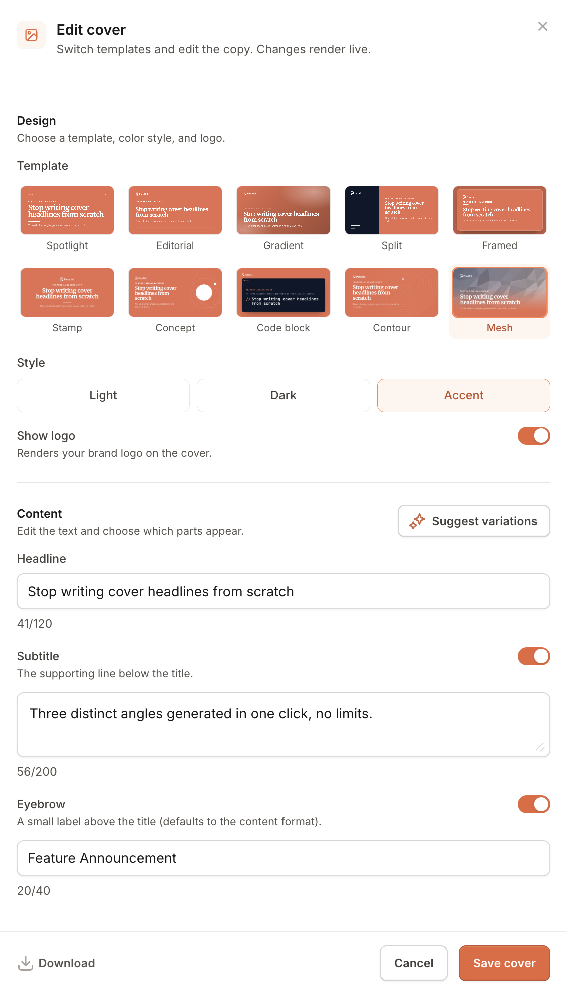
Suggest variations slots into that workflow after the template choice is made. Once you have the visual locked in, one click gives you headline options to match.
Start using it today
If you're already publishing with Parallel, the button is already in your cover editor. Open any draft, navigate to the cover editor, and give it a try on your next post.
If you're new to Parallel, you can try it for free and see the full cover workflow from generation through publication, including suggested headlines, on your first post.